Inspired by Mark Twain’s novel “The Adventures of Tom Sawyer”

One fine Saturday morning, Tom Sawyer was in trouble again. His Aunt Polly had caught him sneaking out of the house in the dead of night, and as punishment, she assigned him a dreaded task: painting the long fence that surrounded their yard. Tom dreaded the thought of spending his entire Saturday working, especially when his friends would be out playing and enjoying the day.
With a heavy heart, Tom approached the fence, bucket of whitewash in hand. The fence stretched out seemingly endlessly before him. He dipped the brush into the whitewash and began to paint. After only a few strokes, he paused and sighed. The day was too beautiful to waste on such a tedious chore.
Numbers vs. Pictures
When thinking about this article, I was heavily inspired by a story from Mark Twain’s novel that I read as a kid.
It reminded me of the first time I saw a huge Excel file at one of my first clients. They had asked me to do an ABC analysis of their customer base.
Similar to Tom, I found a colleague to whom I could delegate the task. I chose Sergey, our data scientist and PhD in automated systems at the time.
A few days later, I was standing in the lobby of our office, which also served as our kitchen, pouring coffee into my favorite mug that I stole from the Salesforce office when Sergey approached me with his laptop.
He showed me the results of the data analysis of the huge file I had given him. The results were presented on one screen with a few pie charts, a small table, and a graph.
At that moment, I realized how different the perception was between what I had as an input—an Excel file with endless numbers that meant nothing—and what I saw now, which could easily fit onto an A4 sheet of paper.
Evolution
You see, we as humans never evolved to perceive numbers. As Yuval Noah Harari mentions in his book “Sapiens: A Brief History of Humankind,” as hunters we had very limited necessity for math.
We only started using mathematics when we transitioned from hunter-gatherer societies to agricultural ones.
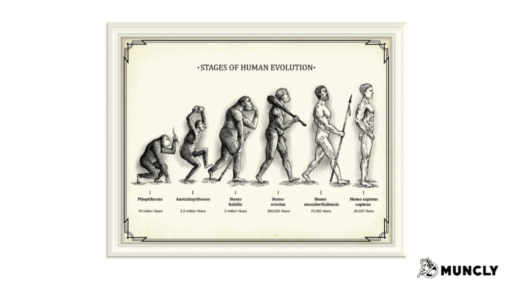
Hunter-gatherers lived in relatively small groups and had a limited need for complex mathematical concepts. However, with the advent of agriculture, humans began to settle in larger communities and produce surplus food, necessitating new ways to manage and record quantities.
But as we evolved and developed into industrial and later post-industrial societies, the amount of data became staggering.
To address that issue, we invented data visualization.
Improved communication
It’s all about perception. Think about illustrating the difference in size. Let’s say we compare the size of Earth to the Sun.
The Sun is 109 times bigger than Earth. Sounds like a lot, right? But look at the image below.
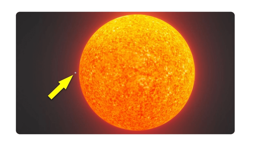
Image source.
Which is more relatable, the number or the image? I bet you will remember the image much faster.
Visualizing data can help you communicate numbers even to those who are emotionally driven and not accustomed to working with numbers daily.
Simplification Complexities
For us, as humans, literally any data can seem complex. I won’t purposefully touch on datasets where multiple correlations need to be compared. Instead, let’s turn to a more down-to-earth example.
Think of your sales numbers in the form of a text report:
- In March, sales numbers equaled $147,824.
- In April, sales grew by 17% to $172,954.
- In May, they shrank by 9% to $157,388.
Now let’s turn this into a simple chart.
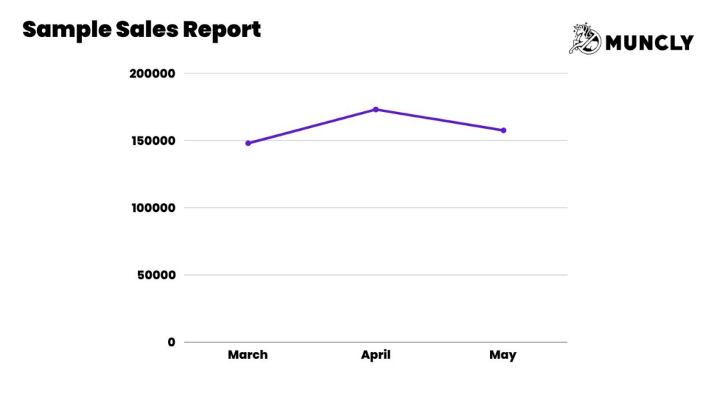
In more complex scenarios, the visual representation of data could result in an even more beneficial outcome. Also using data visualization tools can help anticipate and comprehend trends and identify patterns within data. For instance, if you wanted to represent which channel the sales came from on the same graph and how they compare to each other.
Better data interpretation
I hope you drive a car. Tell me you do.
What’s the most used sensor in a car? The speed sensor. But do you read raw data from the speed sensor? No, you glance at your dashboard, where your speed is represented with a needle or just a number.
It’s a purified and simplified form of sensor reading. Your speed isn’t updated 50 times a second; you’re shown an average representation of your current speed over the last second or so.
That way, you can interpret how your actions correlate with the speed and comply with the law.
Faster Decision Making
I’m never tired of the quote by Rory Sutherland
“More data leads to better decisions, except when it doesn’t.”
Sometimes data visualizations can help you make quick decisions and even remove the burden of making a decision.
For example, you might decide to replace a critical piece of equipment if it causes too much downtime.
I’ve seen companies in the manufacturing industry use heat maps to determine the hours and days with the most equipment downtime.
This helps them find correlations between specific combinations of machinery that, when working together, cause the most issues.
Identification of patterns and trends
A simple line chart, that we are all used to, can help massively when capturing trends.
A friend of mine, Alex, who runs a flower business, uses Google Trends to determine historical periods of high activity in flower searches in every new region he enters.
“Alex, can you mention one data visualization example that helped you?” – asked him during one of our conversations.
“A few years back, when we entered Romania, we realized that during March 8th, the flower industry experiences a huge spike, even bigger than on February 14th. It appears that Romanians celebrate International Women’s Day much more heavily than others. It helped us get prepared during our first year.” – Alex said
Sense of Control
Among many benefits of data visualization, one is an elevated sense of control.
How often do you order a cab? Back in the day, that process involved making a phone call and getting an estimated arrival time in minutes when the driver should appear at your door.
For many people, that caused anxiety. I remember my mother would go outside and wait well before the ETA, even when the weather was terrible, simply because she wanted to be sure the driver would find the house.
Once Uber appeared with its online cab GPS location visualization on the map, that anxiety disappeared. We are now happy to wait even longer since we feel a greater sense of control over the situation, even though we have no real control.
This can also happen in your business or even in your private life. A few years ago, I started tracking our family finances in an app.
Recently, I noticed a spike in expenses for software and realized that I had forgotten to cancel an Adobe Cloud subscription that the company pays for anyway. I got my refund and saved a bit of the family budget.
Survivor Error
But it’s not all rainbows and unicorns. During WWII, a group of scientists was assigned the task of reinforcing airplanes’ most vulnerable areas.
What they did was, every time a warplane would land, they observed and carefully noted the areas with the most hits.
After visualizing the data, something like this appeared on their blueprints:
Blueprints contained areas of an airplane where most hits were located. They were mostly at the wings and the tail.
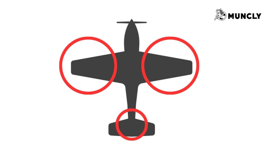
Intuitively, every person would say, “We should reinforce the wings!”
The fact is, you should reinforce the areas that are not on the graph. Since scientists were noting hit areas of the warplanes that returned from battle, what they didn’t note and what was not on the blueprint were areas that were hit and caused the plane to never return. Those areas would not appear on the graph.
It’s called – Survivor error.
Traffic Light
Another great example of a visualized data came from one of my older customers. The company was involved in manufacturing complex engine parts.
Their manufacturing director, Uldis, decided he was done looking through manufacturing reports every morning to spot anomalies and tasked us with building…a traffic light.

He grouped around 90 reports into three domains:
- Velocity: anything related to manufacturing speed and affecting it.
- Cost: anything that would affect production costs.
- Everything else: as you might guess, everything else.
The idea was simple. Every time any piece of data under one of the groups reached a certain threshold, for example, if supply chain managers purchased something that went beyond the cost of what’s perfect, a traffic light would change color.
If things weren’t too bad, it was yellow. If multiple parameters under the same group showed huge anomalies, it would become red.
It was useful, extremely informative, and probably saved him a few years of his life.
The only thing…I never seen it turn green.
Culture of Reporting
In 2009, Los Angeles launched a large LED lighting project with the purpose of making the city more energy efficient and sustainable.
The project involved changing over 140,000 traditional lights to LED panels.
Apart from reducing costs, the administration of the city was able to prolong the hours when the lights could be kept on.
Surprisingly, at the same time, crime rates during the nighttime dropped. Upon closer investigation, it was revealed that streets with LED lights were the most affected.
Brighter lights and longer working hours resulted in a safer environment and a cleaner city. Another side benefit was that real estate prices went up in areas that were traditionally considered unsafe.
Similarly, when your company starts using data visualizations, you will start building a better culture. The more you and your team get used to the new reporting style, the more you will crave new data.
It will initiate a positive feedback loop where you will start revisiting each and every part of your business in search of digitalization opportunities.
Make Data More Relatable & Memorable
Think about yourself having a conversation on the phone and walking into Starbucks to order two coffees. Intuitively, you show the victory sign with your fingers to illustrate the number of beverages you’re ordering.
This is a very memorable sign that the barista wouldn’t miss. It’s sign language, illustrating a number to make communication smoother.
Why not use something similar in your business with your clients, employees, and investors? Complex data visualization helps make your soulless figures relatable and much more memorable.
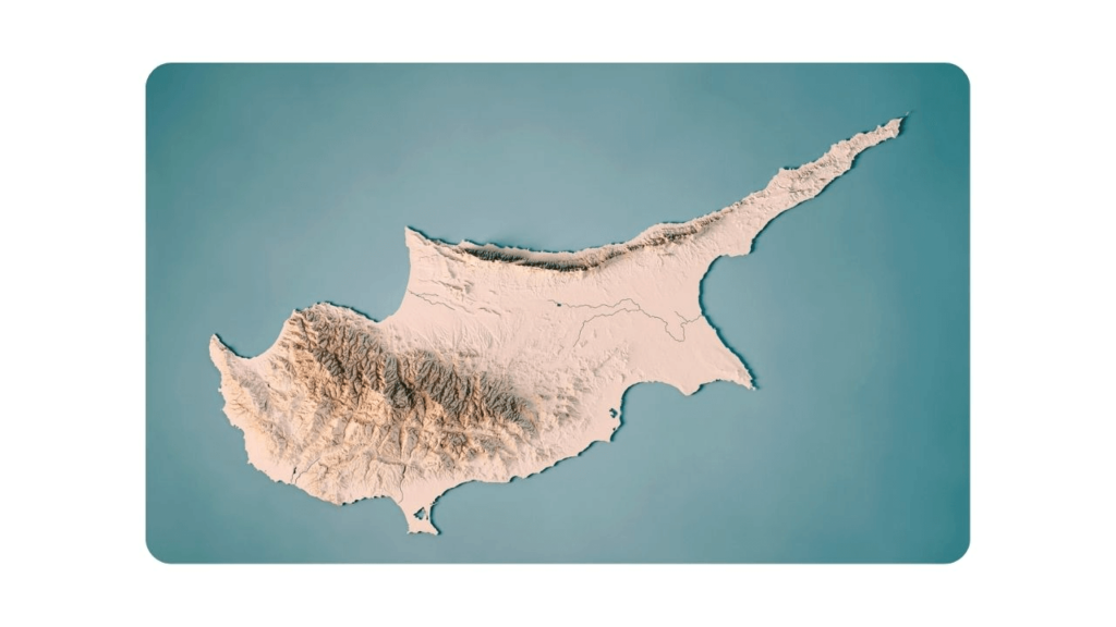
One last example: “In 2019, 9,762 square kilometers of the Amazon rainforest were deforested.”
Versus this image
Closing words
Visualize data as much as you can. It’s a great tool among others. Data visualization tools will help you learn so much more about your business and support whatever idea you are selling.
If you happen to need a helping hand, you can always reach out to me or one of my colleagues, and we can guide you in your data visualization project. Just leave your contact information on our contact page, and we’ll be in touch shortly.
Oh, and don’t forget to subscribe to my CRM Crafter weekly newsletter where I share food for thought. Every Tuesday.
Cheers,
J.
